
도입목적
- 기획, 디자인이 병렬로 진행중인 사항에서 계속적으로 스펙이 변경됨을 반영해서 기획자, 디자이너에 공유를 목적으로 합니다.
- 백엔드와도 병렬로 진행 시 로직(container), 화면(presentation) 분리해서 진행해야함으로 그것을 검증하기 위해서 storybook 단위의 컴포넌트 개발을 진행합니다.
- 추후에 화면단위 테스트 진행 시 storybook을 적극 활용합니다.
- 그외
- 접근성에 대한 부분도 같이 고민하면서 화면단위 컴포넌트를 개발을 진행합니다.
addon-controls 적용
npm i -D @storybook/addon-controls
or
yarn add -dev @storybook/addon-controlsmodule.exports = {
...
"addons": [
...
"@storybook/addon-controls",
...
],
...
}addon-knobs 적용
- @storybook/addon-knobs
- 다양한 컴포넌트와의 상호작용을 할 수 있도록 도와주는 addon 입니다.
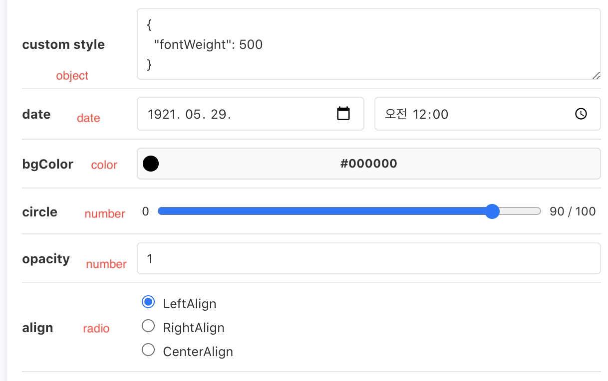
- Knobs 컨트롤 종류
- text: 텍스트를 입력 할 수 있습니다.
- boolean: true/false 값을 체크박스로 설정 할 수 있습니다.
- number: 숫자를 입력 할 수 있습니다. 1~10과 같이 간격을 설정 할 수도 있습니다.
- color: 컬러 팔레트를 통해 색상을 설정 할 수 있습니다.
- object: JSON 형태로 객체 또는 배열을 설정 할 수 있습니다.
- select: 셀렉트 박스를 통하여 여러가지 옵션 중에 하나를 선택 할 수 있습니다.
- radios: Radio 버튼을 통하여 여러가지 옵션 중에 하나를 선택 할 수 있습니다.
- date: 날짜를 선택 할 수 있습니다.

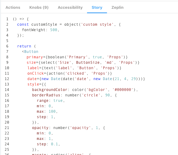
export const ButtonComponent = () => {
  const customStyle = object('custom style', {
    fontWeight: 500,
  });

  return (
    <Button
      primary={boolean('Primary', true, 'Props')}
      size={select('Size', ButtonSize, 'md', 'Props')}
      label={text('label', 'Button', 'Props')}
      onClick={action('clicked', 'Props')}
      date={new Date(date('date', new Date(21, 4, 29)))}
      style={
        backgroundColor: color('bgColor', '#000000'),
        borderRadius: number('circle', 90, {
          range: true,
          min: 0,
          max: 100,
          step: 1,
        }),
        opacity: number('opacity', 1, {
          min: 0,
          max: 1,
          step: 0.1,
        }),
        margin: radios(
          'align',
          {
            LeftAlign: '0',
            RightAlign: '0 0 0 auto',
            CenterAlign: '0 auto',
          },
          '0',
        ),
        ...customStyle,
      }
    />
  );
};- Knobs 컨트롤 그룹
- 기획/디자인 가이드에 제공해야 하는 Props에 대해서는 그룹으로 묶고, 아닐경우 포함하지 않도록 합니다. - Props: 기획/디자인 가이드에 제공 - Other: 기획/디자인 공유를 위한 속성일 경우
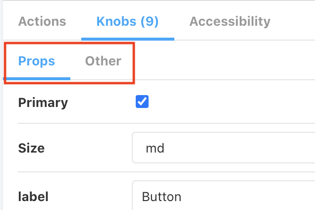
- 기획/디자인 가이드에 제공해야 하는 Props에 대해서는 그룹으로 묶고, 아닐경우 포함하지 않도록 합니다. - Props: 기획/디자인 가이드에 제공 - Other: 기획/디자인 공유를 위한 속성일 경우
// stories
primary={boolean('Primary', true, 'Props')} // Props 그룹일경우

backgroundColor={color('bgColor', '#000000')} // 기획/디자인에만 공유할 경우(3번째 인자를 넣지 않는다.)

// components(Button)
// 기획/디자인에만 공유할 컴포넌트 인경우 rest문법(...props)을 통해서 넣도록 한다.
export const Button = ({ primary, size, label, ...props }) => {
  const mode = primary ? 'storybook-button--primary' : 'storybook-button--secondary';
  return (
    <button
      type="button"
      className={['storybook-button', `storybook-button--${size}`, mode].join(' ')}
      {...props}
    >
      {label}
    </button>
  );
};-
Knobs 컨트롤 스타일
-
class style 동적생성
- className={[‘storybook-button’,
storybook-button--${size}, mode].join(’ ’)}
// stories primary={boolean('Primary', true, 'Props')} // Props 그룹일경우 // components(Button) // 기획/디자인에만 공유할 컴포넌트 인경우 rest문법(...props)을 통해서 넣도록 한다. export const Button = ({ primary, size, label, ...props }) => { const mode = primary ? 'storybook-button--primary' : 'storybook-button--secondary'; return ( <button type="button" className={['storybook-button', `storybook-button--${size}`, mode].join(' ')} {...props} > {label} </button> ); }; - className={[‘storybook-button’,
-
style 동적생성
<Button
  primary={boolean('Primary', true, 'Props')}
  size={select('Size', ButtonSize, 'md', 'Props')}
  label={text('label', 'Button', 'Props')}
  onClick={action('clicked', 'Props')}
  date={new Date(date('date', new Date(21, 4, 29)))}
  style={
    backgroundColor: color('bgColor', '#000000'),
    borderRadius: number('circle', 90, {
      range: true,
      min: 0,
      max: 100,
      step: 1,
    }),
    opacity: number('opacity', 1, {
      min: 0,
      max: 1,
      step: 0.1,
    }),
    margin: radios(
      'align',
      {
        LeftAlign: '0',
        RightAlign: '0 0 0 auto',
        CenterAlign: '0 auto',
      },
      '0',
    ),
    ...customStyle,
  }
/>
-
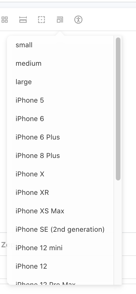
addon-viewport 적용
- @storybook/addon-viewport
- 반응형 대응을 위해 도와주는 addon 입니다.
- Configuration 설정
- storybook에서 제공해주는 기본 Viewport와 커스텀 Viewport 나눠서 작업을 진행합니다.
- storybook에서 제공해주는 기본 Viewport와 커스텀 Viewport 나눠서 작업을 진행합니다.
viewport: { //👇 The viewports you want to use
viewports: {
small: {
name: 'small',
styles: {
width: '768px',
height: '100%',
}
},
medium: {
name: 'medium',
styles: {
width: '1096px',
height: '100%',
}
},
large: {
name: 'large',
styles: {
width: '1440px',
height: '100%',
}
},
...INITIAL_VIEWPORTS
},
//👇 Your own default viewport
defaultViewport: 'iphoneX',
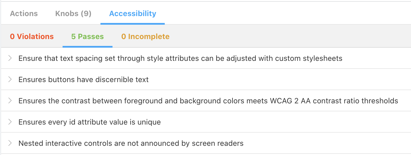
},addon-ally(접근성) 적용
- @storybook/addon-a11y
- 웹접근성을 도와주는 addon 입니다.

- 웹접근성을 도와주는 addon 입니다.
export default {
  title: 'Example/Button',
  component: Button,
  parameters: {
    parameters: {
      a11y: {
        // optional selector which element to inspect
        element: '#root',
        // axe-core configurationOptions (https://github.com/dequelabs/axe-core/blob/develop/doc/API.md#parameters-1)
        config: {},
        // axe-core optionsParameter (https://github.com/dequelabs/axe-core/blob/develop/doc/API.md#options-parameter)
        options: {},
        // optional flag to prevent the automatic check
        manual: true,
      },
    },
  },
};
addon-notes(노트) 적용
- @storybook/addon-notes
- 스토리북에 노트를 하기 위한 addon 입니다.
- 왜 해야할까??
- 기획/디자인 제플린을 기준으로 개발을 진행 후 QA진행 시 검증 시 주의할 사항이나 검증해줬으면 하는 내용에 대해서 note를 통해서 공유하고자 합니다.
- 기획/디자인 제플린을 기준으로 개발을 진행 후 QA진행 시 검증 시 주의할 사항이나 검증해줬으면 하는 내용에 대해서 note를 통해서 공유하고자 합니다.
export default {
title: 'Example/Button',
component: Button,
parameters: {
notes: `
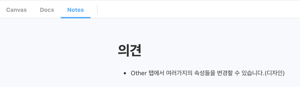
# 의견
- Other 탭에서 여러가지의 속성들을 변경할 수 있습니다.(디자인)
`,
},
};addon-sources 적용
- @storybook/addon-storysource
- 스토리북에 테스트 하는 실제 컴포넌트를 보여주기 위한 addon 입니다.
-
// ./storybook/main.js
module.exports = {
  stories: ['../src/**/*.stories.mdx', '../src/**/*.stories.@(js|jsx|ts|tsx)'],
  addons: ['@storybook/addon-storysource'],
};
addon-zeplin 적용
- storybook-zeplin
- 스토리북에서 zeplin에 대한 내용을 보여주기 위한 addon 입니다.
- 사용방법
- access token 연동
- https://app.zeplin.io/profile/developer(Personal access tokens 키 생성)
- .env 파일에 추가
- .envSTORYBOOK_ZEPLIN_TOKEN=~~
- 참고: https://www.npmjs.com/package/storybook-zeplin
- access token 연동
// ./storybook/main.js
module.exports = {
  "stories": [
    "../src/**/*.stories.mdx",
    "../src/**/*.stories.@(js|jsx|ts|tsx)"
  ],
  "addons": [
    "storybook-zeplin/register"
  ]
}

// ~.stories.jsx
export default {
  title: 'Example/Button',
  component: Button,
  parameters: {
    zeplinLink: "zpl://screen?sid=5f6da3834811cd83eb77dd96&pid=5c3ff05bd363b1bf6d18294d",
  },
};

// ./.env
# .env
STORYBOOK_ZEPLIN_TOKEN=
typescript 적용
https://developer0809.tistory.com/171