css-in-js
Why was CSS-in-JS created?
CSS-in-JS, as the name suggests, refers to the approach of writing CSS within JavaScript code. It was first introduced in 2014 by Christopher Chedeau (aka Vjeux), a developer at Facebook.
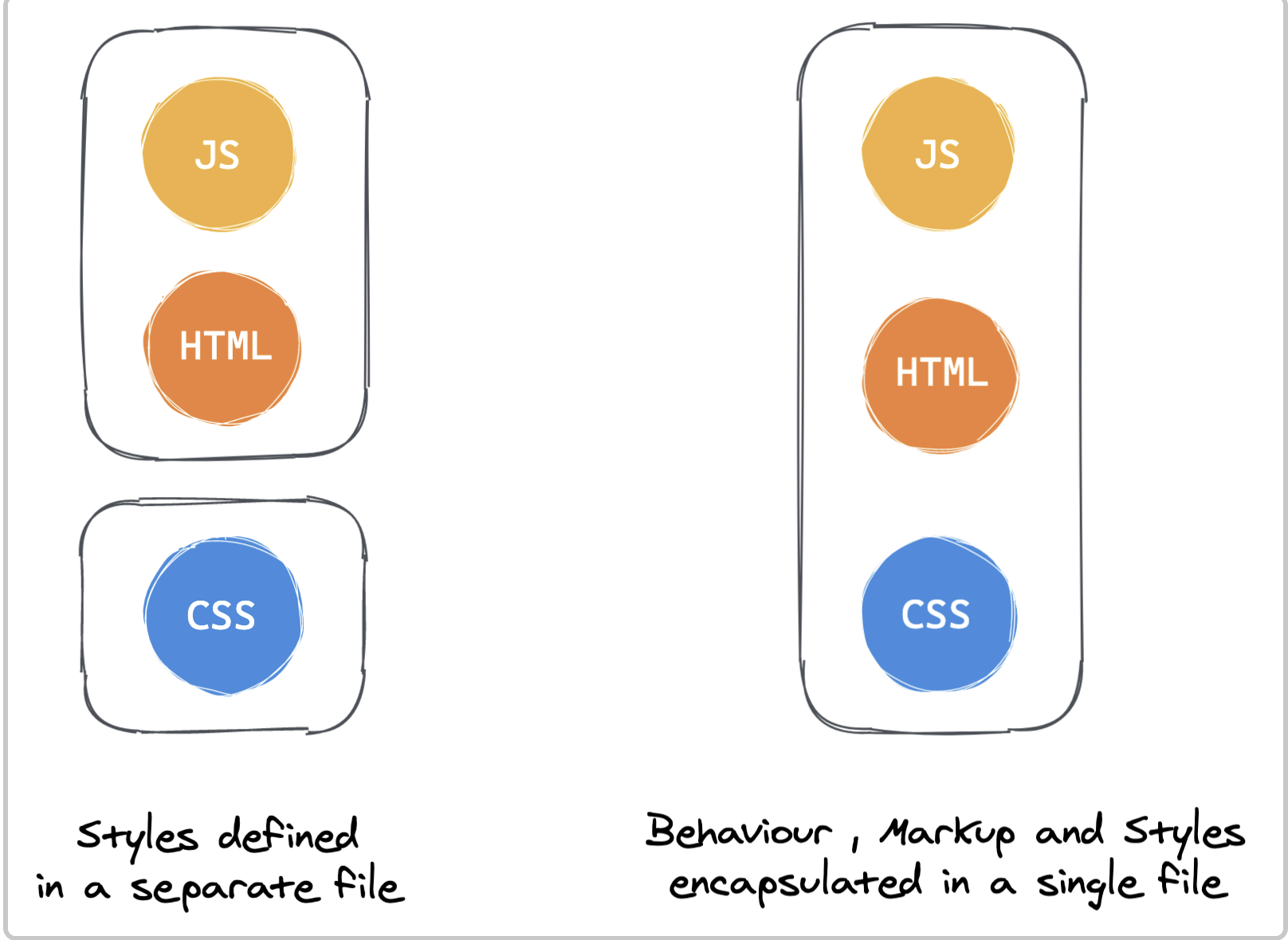
Vjeux described the difficulties of writing CSS as follows, and emphasized that CSS-in-JS could solve all of these issues.
-
Global namespace: A naming convention is required for names declared in the global space
- Issue
- Because CSS was originally designed to style documents, it has no concept of modular scope (a global scope/namespace)
- CSS methodologies (BEM) and Module/Scope formats were meant to keep CSS rules from affecting multiple elements, but they still do not support module-level scoping
- Solution
- Because CSS-in-JS defines styles in JS, style variables are limited to lexical scope (component-level scope)
- CSS-in-JS lets you export/import style variables freely, making reuse possible
import styled from 'styled-components' export const Container = styled.div` display: flex; flex-direction: column; height: 100%; `; const Template: FunctionComponent<TemplateProps> = function ({ return ( <Container> ... </Container> ); }); - Issue
-
Implicit Dependencies: Managing dependency relationships
- Issue
- Because JS/CSS modules are separated, the relationship between className/attribute is not explicit, so developers have to remember and manage it themselves, which is difficult
- Solution
- Because CSS-in-JS writes CSS inside JS, static analysis is possible, and with the help of the IDE it becomes easy to manage whether something is used or unused
- Issue
-
Dead Code Elimination: Detecting unused code
- Issue
- Because managing dependencies is difficult, it is hard to determine whether code is unused (dead code)
- You can use Google Chrome's coverage tool, but it requires additional working time
- Solution
- If you use CSS-in-JS, you can easily remove unused code with the help of eslint and the IDE
- Issue
-
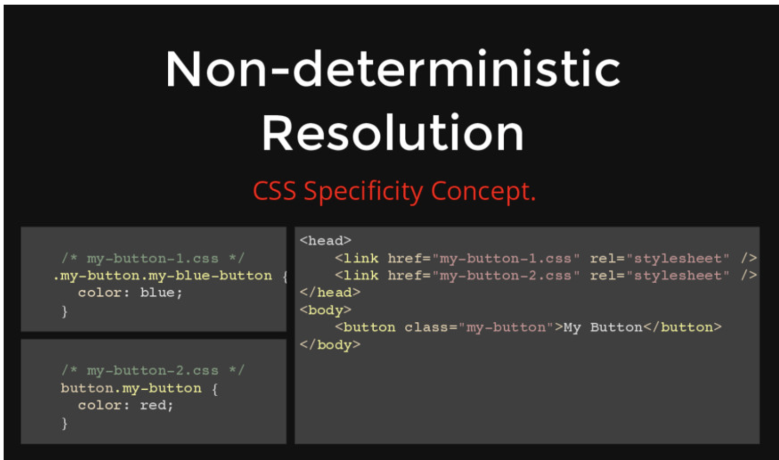
Non-deterministic Resolution
- Issue
- CSS rules with higher specificity are applied. However, if they have the same specificity, the rule defined later is applied.
- If you load CSS with the same specificity asynchronously, which CSS rule will be applied? The answer is you don't know.
- This is called Non-deterministic Resolution.
- Solution
- By tightly coupling HTML/CSS/JS at the module (component) level, you can control and determine CSS priority.
- Issue
-
Minification: Minimizing class names
// module.css .DetailInfoHeader_titleInfo__2XYNF { } // styled-components .kuddxf { ... } -
Sharing Constants: Sharing state between JS and CSS
// css-in-js 사용 전(css/js 상태 공유X) /* common.css */ :root { --primary-color: #2294e3; --border-color: #9a9a9a; } /* app.tsx */ const --primary-color: '#2294e3'; <article style={ background: `${--primary-color}` } // css-in-js 사용 전(css/js 상태 공유O) :root { --primary-color: #2294e3; --border-color: #9a9a9a; } const ArticleWrapper = styled.article` background: var(--primary-color); `; <ArticleWrapper></ArticleWrapper> -
Breaking Isolation: The problem of managing external modifications to CSS being difficult
- To easily achieve feature reusability and apply custom styles, it is more efficient to manage CSS/JS together
- In the case of Vue/Svelte and others, this is handled by bundling style/script/html together in a single-file-component approach
- In React, the goal is to bundle and manage them within the JS ecosystem using the CSS-in-JS approach
styled-components
styled-components
Installation
$ npm install styled-components
# or
$ yarn add styled-components
Basic usage ( sass syntax support )
import React from 'react';
import styled from 'styled-components';

const Circle = styled.div`
  width: 5rem;
  height: 5rem;
  background: black;
  border-radius: 50%;

  > a {
    color: #bfcbd9;
    text-decoration: none;
  }

  &:hover {
    opacity: 0.1;
  }
`;

export const AutoLayoutStyle = css`
  width: 100%;
  height: 100%;
`;

function App() {
  return <Circle />;
}

export default App;
Sass - lighten() or darken() : polished
yarn add polished

import React from 'react';
import styled from 'styled-components';
import { darken, lighten } from 'polished';

const StyledButton = styled.button`
  background: darken($w9-color-primary, 20%); - scss

  /* 색상 */
  background: #228be6;
  &:hover {
    background: ${lighten(0.1, '#228be6')}; - polished
  }
  &:active {
    background: ${darken(0.1, '#228be6')}; - polished
  }

`;

function Button({ children, ...rest }) {
  return <StyledButton {...rest}>{children}</StyledButton>;
}

export default Button;
Applying global styles with ThemeProvider
Before you start styling, creating frequently used information such as color codes, sizes, fonts, and media queries as variables allows for consistent style management
import React from 'react';
import styled, { ThemeProvider } from 'styled-components';
import Button from './components/Button';

const AppBlock = styled.div`
  width: 512px;
  margin: 0 auto;
  margin-top: 4rem;
  border: 1px solid black;
  padding: 1rem;
`;

function App() {
  return (
    <ThemeProvider
      theme={
        palette: {
          blue: '#228be6',
          gray: '#495057',
          pink: '#f06595',
        },
      }
    >
      <AppBlock>
        <Button color="gray">BUTTON</Button>
        <Button color="gray">BUTTON</Button>
        <Button color="pink">BUTTON</Button>
      </AppBlock>
    </ThemeProvider>
  );
}

export default App;
Component inheritance
export const TileDiv = styled.div`
  display: flex;
  flex: 1;
  margin: 0 auto;
  max-width: 1550px;
`;

import { TileDiv } from './styles/CommonStyle';

const ContactDiv = styled(TileDiv)`
  flex-direction: column;
  padding: 5px;
  box-sizing: border-box;
`;
Inserting css
export const AutoLayoutStyle = css`
  width: 100%;
  height: 100%;
`;

export const DirectSizeStyle = ({ width, height }) => css`
  width: ${width};
  min-width: ${width};
  height: ${height};
  min-height: ${height};
`;

import { AutoLayoutStyle } from './styles/CommonStyle';
const IntroduceDiv = styled.div`
  ${AutoLayoutStyle};
  ${DirectSizeStyle({ width: '200px', height: '200px' })};
`;

const CompItemContentTitleDiv = styled.div`
  display: flex;
  color: #008073;
  font-size: 20px;
  font-weight: 600;

  ${css`
    > span {
      cursor: pointer;
      height: 12px;
      padding-bottom: 10px;
      &:hover {
        border-bottom: 2px solid #008073;
      }
    }
  `}
`;
Inserting data (especially images)
import HomeImg from '../../imgs/bg-home.jpg';
const HomeBody = styled.div`
  background: url(${HomeImg}) no-repeat center center;
`;
Passing props and conditional branching
const SideBarDiv = styled.div`
  ${AutoLayoutStyle};
  max-width: ${props => (props.isSidebarOpen ? '170px' : '0px')};
  max-width: ${props => (props.isSidebarOpen ? '170px' : '0px')};
`;

function SideBar({ isSidebarOpen }) {
  return <SideBarDiv isSidebarOpen={isSidebarOpen} />;
}
Handling attributes
import circle from '../../../imgs/circle.svg';
export const ListItemCircleImg = styled.img.attrs({
  src: circle,
  alt: '',
})`
  margin-right: 5px;
`;

const PasswordInput = styled.input.attrs(props => ({
  // Every <PasswordInput /> should be type="password"
  type: 'password',
}))``;
Handling global styles (createGlobalStyle)
import React from "react";
    import styled, { createGlobalStyle } from "styled-components";

    const GlobalStyle = createGlobalStyle`
			*, *::before, *::after {
			    box-sizing: border-box;
			  }
      body {
        margin: 50px;
        padding: 50px;
        background-color: black;
      }
    `;
    ...
    const App = () => {
      return (
        <Container>
          <GlobalStyle />
          <Button>버튼1</Button>
          <Button color="red">버튼2</Button>
        </Container>
      );
    };

import theme from '/src/styles/theme'

return (
    <ThemeProvider theme={theme}>
      <GlobalStyle />
      <Header switchTheme={switchTheme} />
      <Container currentThemeText={currentThemeText} />
    </ThemeProvider>
  );

const GlobalStyle = createGlobalStyle`
    ${reset};
    ${customReset};

    html {
      font-size: 62.5%; //1rem = 10px;
    }

    ${({ theme }) => {
      return css`
        body {
          font-family: ${theme.fonts.family.base};
          font-weight: ${theme.fonts.weight.normal};
          font-size: ${theme.fonts.size.base};
        }
      `;
    }}
`;
animations
// Create the keyframes
const rotate = keyframes`
from {
transform: rotate(0deg);
}
to {
transform: rotate(360deg);
}
`;
// Here we create a component that will rotate everything we pass in over two seconds
const Rotate = styled.div`
display: inline-block;
animation: ${rotate} 2s linear infinite;
padding: 2rem 1rem;
font-size: 1.2rem;
`;
render(<Rotate>< 💅🏾 ></Rotate>);SCSS import support
import { createGlobalStyle, css } from 'styled-components';
import reset from 'styled-reset';
import customReset from './customReset.scss'; // waffle에 scss 도입가능한지 확인??

const GlobalStyle = createGlobalStyle`
    ${reset};
    ${customReset};

    html {
      font-size: 62.5%; //1rem = 10px;
    }

    ${({ theme }) => {
      return css`
        body {
          font-family: ${theme.fonts.family.base};
          font-weight: ${theme.fonts.weight.normal};
          font-size: ${theme.fonts.size.base};
        }
      `;
    }}
`;

export default GlobalStyle;
Emotion
Emotion
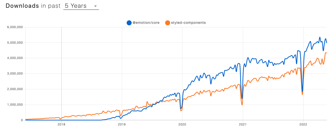
- A CSS-in-JS library similar to styled-components
- material-ui(v5) - emotion applied
- https://www.howdy-mj.me/css/emotion.js-intro/
- https://emotion.sh/docs/introduction
- https://hoontae24.github.io/19